Blog Archives

Pelicans in the US 1945 – 1948
I’ve looked in previous posts at the development of Penguin Books in the US, first from 1942 to 1945 and then from 1945 to 1948, a period that led up to the final rift with the UK business and the creation of the New American Library. That rift was probably as much as anything to do with the use of illustrated covers in the American market, although Allen Lane seems to have seen it as a much wider difference of opinion over the direction of the business. His perception was that the business was going too far downmarket, publishing too many books of dubious morality.
That perception is challenged by the development of Pelican Books in the US. Victor Weybright, who had taken charge of the US Penguin business alongside Kurt Enoch, after Ian Ballantine’s departure, had been seriously impressed by Pelican Books in the UK. He saw a gap in the US market for a non-fiction paperback series and was convinced that Penguin could fill it with an American version of Pelicans.


The US Pelican series launched at the end of 1945 or the start of 1946 with a mixture of books sourced from Penguin in the UK, and others sourced from American publishers. The first volume, P1, was ‘Public Opinion’ by Walter Lippmann, first published in 1922 and a classic American text. It was followed by ‘Patterns of Culture’ by the American anthropologist, Ruth Benedict, hardly less classic – and then by a British text, ‘You and Music’ by Christian Darnton, that had appeared in the UK Pelican series as volume A68.
Slightly oddly, these first three numbered volumes are all dated January 1946, while volume P4, George Gamow’s ‘The birth and death of the Sun’, is shown as published in December 1945. Also slightly oddly, Weybright’s autobiography recalls ‘The revolt of the masses’ by José Ortega y Gasset as one of the first titles, although it did not appear until much later, after the split with Penguin in the UK.


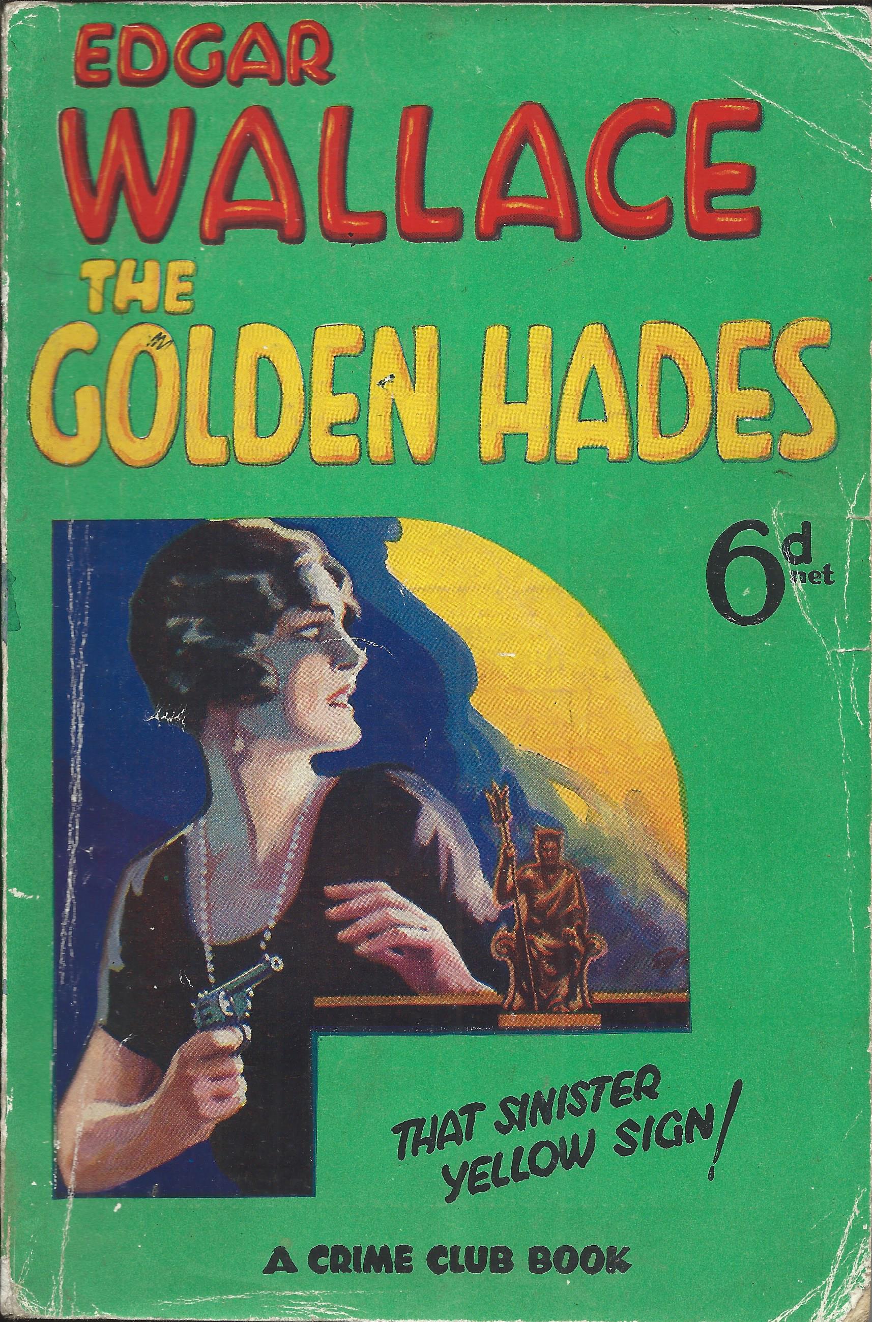
The volumes look very similar to the main series US Penguins in the new format introduced at that time, with a Pelican logo in a circle replacing the various shapes used for the Penguin logo. The price was the same at 25c, the covers have the same plastic laminating, now often peeling away, and the cover designs, almost all by Robert Jonas, look very similar too.
By the end of 1946 the series had reached 11 volumes, and the eleventh volume, ‘Heredity, race and society’ by L.C. Dunn & T.H. Dobzhansky, is the first one to be a new book specially written for the series, rather than a reprint. In the UK, Pelicans had started as a reprint series before moving to commission their own books, and the process was now underway in the US as well. P11 was also the first for a period to have no direct indication of price on the book. It was becoming difficult to maintain the standard price of 25c and for a few months no price was indicated, although some books carry a 35c sticker. From volume P18 onward, the price is marked as 35c.


The format of mixing UK reprints with more specifically American books continued throughout 1947, while negotiations for the separation from UK Penguin went on. In October, E.V. Rieu’s translation of ‘The Odyssey’ that had been a surprising literary success in the UK, and had sold well also in the US Penguin main series, moved across to the Pelican series as volume P21. It followed another, perhaps less surprising success, Kenneth Walker’s ‘The physiology of sex’ that had been reprinted several times in the main series before appearing as a Pelican too.


Then in November 1947, Dunn & Dobzhansky’s ‘Heredity, race and society’ was reprinted, but given a new number as volume P23. I am not aware of any of the other volumes in the series being reprinted as Pelicans, either under the same or a different number.
As far as I can tell (from not only several decades, but several thousand miles away), this series was very unusual in the US market at the time. Paperbacks were generally downmarket and seen as not very serious. For a paperback publisher to be publishing not only non-fiction, but serious intellectual non-fiction (anthropology, astronomy, modern architecture, and sex) was at least surprising, if not groundbreaking.


So did it matter that it was doing so with illustrated covers (and hardly salacious ones)? And yet, for Allen Lane it seems that it did. His US business was publishing not only this kind of serious non-fiction, but in its fiction list, D.H. Lawrence, Joseph Conrad, Henry James, John Steinbeck, Bernard Shaw, Pearl Buck and William Faulkner (the latter four all, sooner or later, awarded the Nobel Prize for Literature). And still it seems, Lane felt it was straying too far from the traditions (little more than a decade old) of Penguin Books in the UK. Rather than focusing on The Odyssey or other Pelican titles, Lane saw novels by James M. Cain, James T. Farrell and Erskine Caldwell, and he saw, and disliked, the illustrated covers.
In ‘The Penguin Story’, published by Penguin in 1966 and, although written by Bill Williams, probably as close as we can get to Penguin history as Allen Lane wanted it to be seen, there is a remarkable attack on the position of Weybright and Enoch. After the split from Penguin in the UK, Lane is reputed to have never talked to Weybright again, and it seems that almost twenty years later, he still held a grudge.


Penguin’s ‘American associates’, writes Williams, without naming them, ‘wanted the mass market in terms of quarter million sales or more, for every title’. To achieve this they used distribution outlets ‘with no interest in books as such’ and that preferred ‘a commodity with garish and sensational eye-appeal’. ‘The contents of the book … were relatively unimportant: what mattered was that its lurid exterior should ambush the customers’. It seems to me difficult to sustain this charge against the range of titles published in the US Pelican series and their cover designs, or indeed against the US Penguins in the same period – but judge for yourself.
By October 1947 the split had been agreed and from early 1948 was being implemented. Penguins were re-branded as Signet Books and Pelicans as Mentor Books, both under the overall heading of the New American Library. For a brief period, Pelicans appeared as ‘Pelican Mentor Books’ and the numbering moved from P25 to M26, M27 etc. Volumes M26 to M29, published from March to June 1948, had the dual branding, and then traces of Pelican disappeared from the American market.


US Penguins 1945 – 1948
Where I left the story in my last post (US Penguins 1942 – 1945), Ian Ballantine had left the business to help found Bantam Books. For a period, Allen Lane sent Eunice Frost out to New York to work with Kurt Enoch, probably not just to help him out, but to keep an eye on him.
That was only ever a temporary measure – Eunice Frost was too valuable back at Head Office – but Lane had his eye on a longer term solution. He had made contact with Victor Weybright, an American with publishing experience who had been working at the American Embassy in London during the war.

Allen Lane needed someone to act as a balance to Kurt Enoch, whom he no longer fully trusted. Enoch had taken the business a long way away from the founding principles of Penguin, competing head-to-head with Pocket Books, Dell Books and others on their terms, rather than trying to change the market. US Penguins had adopted illustrated covers on US style glossy card and the standard size of other local competitors. And the quality of the list was arguably not consistent with Penguin’s UK positioning either.

But Enoch had a personal stake in the capital of the US business and as he had organised the capital raising, some of the rest was held by his friends and associates. So both Allen Lane and Victor Weybright had to tread carefully at first.
Lane’s policy seems to have been one of constructive ambiguity – sending Weybright out more or less to negotiate his own way into the business. When he arrived, Enoch claimed not to have heard of him and was unwilling to meet him. After a two hour wait outside a closed door, there followed a week of talks mostly conducted through lawyers. The story is told from Weybright’s point of view in his autobiography, although this is highly self-serving and may not be entirely reliable.
But in the end an agreement was reached, which Weybright characterised as ‘absolute parity’ for the two men in terms of status within the organisation. Enoch would concentrate on production and distribution and Weybright on the publishing programme and public relations, an area where he considered Enoch’s abilities extremely limited. Perhaps surprisingly after such a difficult start, they formed an effective partnership that not only stayed together for many years, but was highly successful in a very competitive market. Enoch initially saw Weybright simply as a stooge for Allen Lane, but it was not long before the two of them were united in negotiating a break from Lane and from Penguin Books.

It’s hard to know exactly when Weybright’s influence began to be seen in terms of the series itself. He arrived in August 1945, but probably had little effect on the books published in the following few months. They included notably ‘Trouble in July’ by Erskine Caldwell, an author not approved of by Lane, but who became enormously important for the business over the following years.
Weybright almost certainly though was influential in the major changes that took place from January 1946 and included a significant redesign in the look and feel of the books, as well as the launch of a non-fiction Pelican list. Both were important developments that had long-lasting effects, but I’ll leave discussion of the US Pelican list for another day.


In some ways the re-design was just another step in the gradual transition that had been going on for three to four years already, away from the UK Penguin style and towards fully illustrated covers. It introduced full colour printing and illustrations stretching right across the front cover, and perhaps even more symbolically, it abandoned the colour-coding that had been such a key part of the Penguin brand, in favour of a bizarre system of different shaped symbols to indicate genre. The changes could be seen as the final break with the sober traditions of Penguin in the UK.
But in another way the business was actually moving back towards some of the key Penguin attributes in the UK. In particular the size of the books changed back to the standard UK size, distinguishing them from most other US paperbacks. And although not immediately apparent (perhaps not even to Allen Lane), the nature of the list was changing to one that was maybe more in line with Penguin principles.


From a list that throughout most of 1944 and 1945 had been dominated by crime novels and relatively light fiction, there were now indications of more serious literature. D.H. Lawrence and E.M. Forster appeared in the January 1946 list, Virginia Woolf, Jack London, Sherwood Anderson and John Steinbeck over the next few months, and then in July, three plays by Bernard Shaw were issued to mark Shaw’s 90th birthday. Weybright was diplomatically taking some of the best of Penguin’s output from the UK and mixing it with more specifically American titles.
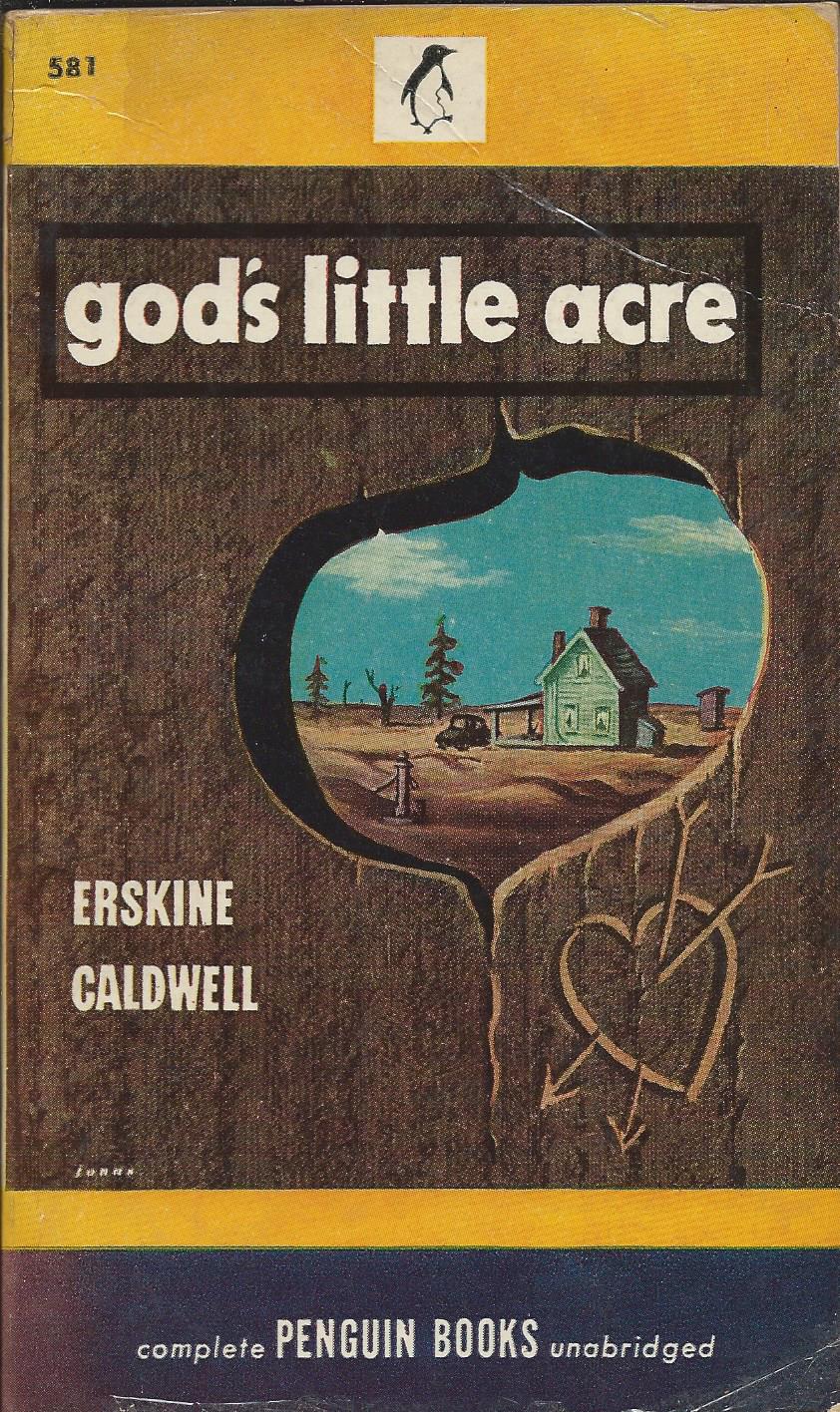
There were still plenty of lighter novels, and several that were too racy for Allen Lane’s taste. Weybright records that Lane seemed annoyed by the fact that Erskine Caldwell’s ‘God’s Little Acre’ was a runaway success, supporting the business through a difficult time. But the proportion of crime stories certainly went down and there does seem to have been a serious attempt to position the series as rather more up-market and literary. Indeed I’d suggest that the 80 or so books published in 1946 and 1947 stand comparison with almost any run of 80 books appearing in the UK Penguin main series.
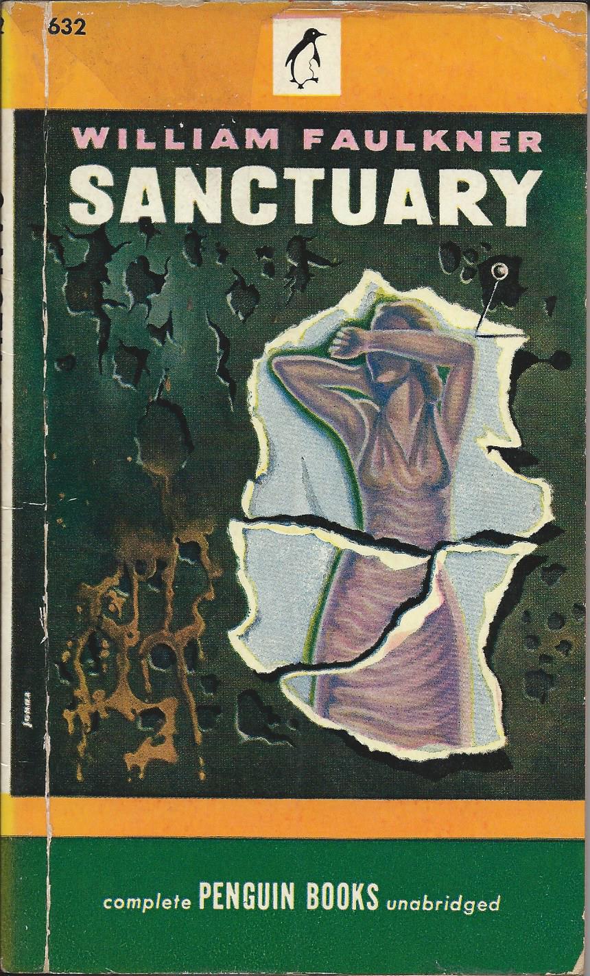
In September 1946 Lady Chatterley’s Lover appeared as volume 610 and it was followed in November by E.V. Rieu’s new translation of ‘The Odyssey’ published by Penguin in the UK. Early 1947 saw Henry James and Joseph Conrad added to the list followed by William Faulkner’s ‘Sanctuary’. Lane disapproved of Faulkner, but when he was awarded the Nobel Prize for Literature in 1949, Weybright must have felt vindicated, as indeed when Lane later fought a court battle to publish Lady Chatterley in the UK.

Of course part of Allen Lane’s disapproval stemmed from the illustrated covers rather than the actual contents of the books. The covers were undoubtedly becoming more colourful and striking (regarded by Weybright as a necessity to compete in the US market), but Lane’s generalised slur on illustrated covers as nothing but ‘bosoms and bottoms’ would not have been a fair description of them, at least in 1946/1947.
Most of the covers were designed by Robert Jonas, often featuring stylised images evoking the spirit of the books rather than specific scenes from them. The Jonas covers are often described as having a distinctive style, but in fact several of the covers by other artists seem to me to be consistent with them, so it may be more of a house style influenced by Jonas rather than just the style of one artist.


When Allen Lane visited New York in April 1947 it became clear that a split with the UK business was inevitable. The terms were negotiated in October of that year and by February 1948 the changes were under way. Penguins were to be re-branded as Signet Books, while Pelicans became Mentor Books – the overall business becoming the New American Library. For a period in early 1948 books were branded as ‘Penguin Signet’ but from August 1948 references to Penguin were dropped and the business was on its own.
Freed of UK constraints, the cover art took another turn. Robert Jonas was for a time Art Director, but from about November 1947 his stylised designs started to give way to a more brash style of which Allen Lane would certainly not have approved. Penguins had come a long way in a relatively short time.


US Penguins 1942 – 1945
Penguin’s attempt to woo the American market had started in 1939 with the establishment of an office in New York under the twenty-three year old Ian Ballantine, importing Penguins from the UK. It was not a great time though to be shipping books across the Atlantic and by 1941 it was clear that the operation had no future unless books could be produced locally.

A small number of UK books were reprinted in the US, but to extend the operation and move into local publishing, Allen Lane would need a more experienced publisher. He was perhaps lucky to find Kurt Enoch, one of the founders of Albatross Books, and a Jew who had been forced by the Nazis to leave Germany and then subsequently had had to flee for a second time from Paris, after it fell to the German army ( for the full story, see ‘A strange bird’ by Michele Troy).

Enoch had recently arrived in the US, was looking for work, and suggested to Lane that he could raise the capital to launch a local publishing programme. Lane took him on as Vice President responsible for production and design, with Ballantine in charge of distribution / sales. That leaves it a little unclear who was responsible for the core function of choosing and commissioning new titles. Enoch was the one with experience in this area at the time, so presumably took the lead, although Ballantine later went on to become a hugely successful publisher in his own right.
Albatross Books had been in many ways the model for Penguin, so Allen Lane might reasonably have expected to find in Kurt Enoch somebody who shared his ideals and vision for the business. But from the start Enoch seems to have had doubts about key parts of the Penguin brand that had been so successful in the UK.


Penguin’s UK launch had been almost an overnight success and had transformed the UK paperback market, with almost all competitors adopting the main elements of the Penguin ‘package’ – size, price, colour coding, dustwrappers and so on, but above all, no cover illustration. The first tentative steps in the US market had not triggered any similar revolution and Enoch seems to have been sceptical that it ever could. Almost from day one, he seems to have had his eye on illustrated covers.
For Allen Lane and others back in Harmondsworth though, this was an article of faith. Before Penguin’s UK launch, there had been plenty of people saying that non-illustrated covers could never work in the UK market and they had proved them all wrong. Now they saw the brightly striped and immediately recognisable covers of Penguin Books as their main weapon in conquering new markets. The scene was set for a struggle that could have profound consequences for Penguin’s future.

In early 1942 the new US Penguin series launched, with numbers starting from 501. The first two books, numbers 501 and 502, appeared with the iconic striped covers. First blood to the Brits. But by volume 503 the design had changed significantly to one that allowed space on the front for a brief written description of the book, and on the back for advertising or for information about the author. Enoch must have been planning this for some time, perhaps waiting for approval from Head Office.


While Lane may not have been happy with any move away from the classic design, this change looks as though it may have been deliberately designed to get approval. It retains enough elements of Penguin identity to still look Penguin-ish and it’s still a very restrained design that doesn’t introduce any illustration to the front cover. It also retains the principle of colour coding used in the UK. Crime is still green, although perhaps strangely, the classic Penguin orange for novels is replaced by red, and yellow is more widely used for a range of books including non-fiction and westerns.

But this was by no means the limit of Enoch’s ambitions. He wanted cover illustration, and as it happened he had the right opportunity to get a foot into the door. A short series of classic texts illustrated by woodcuts had appeared in the UK in 1938 as Penguin Illustrated Classics. They had used illustration on the covers and had included ‘Walden’ by Thoreau, an American classic that would fit well into the new US Penguin series. How could the UK Head Office possibly object to a cover illustration that they had themselves used? The book appeared as volume 508 and was the first American Penguin to feature cover art.

Once the principle had been breached, Enoch was not going to let go. He had shown how a simple illustration could (not coincidentally?) fit well into the cover design he had introduced and others would follow. The first was ‘Tombstone’ by Walter Noble Burns, volume 514 published in October 1942, and from then on illustrated covers were the norm. It may have grated even more in the UK that the process started with a western – at this stage considered too down market for Penguin in the UK, although later on in the series, a few did appear.


The first illustrations were quite small, but it was not long before they were taking up the entire panel. And in the meantime, Enoch was attacking another of Penguin’s key brand attributes – the size of the books. Penguins had always been roughly 11 cm by 18 cm, a format based on the golden ratio and again copied from Albatross. But paperbacks in the US and particularly those from the main competitor, Pocket Books, were shorter and squatter. So Penguin moved in line with them.


This was in November 1943, barely 18 months after the launch and already Penguins had little in common with their UK parents and looked more like the local competitors. Even the glossy card covers and the red page edges looked more American than British. Any idea of changing the market had been abandoned. It was the Penguins that were having to change.
From late 1943 onwards, the rate of new titles started to increase and the cover illustrations became more and more dominant, with the single colour of the covers increasingly used within the picture as well. From volume 566 in October 1945, a second colour is used on the cover before moving on to full colour shortly afterwards.


This was though another turbulent period for the business. Some time around the end of 1944 or the beginning of 1945, Ian Ballantine resigned to work on the launch of a competitor, Bantam Books. He had learned what he could from Enoch and was ready to take the next step in his publishing career. Allen Lane however was not prepared to leave Kurt Enoch in sole charge of Penguin’s US business. Eunice Frost, originally Allen Lane’s secretary and still in her twenties, but in practice one of his closest aides in London, was sent out to New York to hold the fort, while Lane attempted to make more permanent arrangements.
That eventually led to the appointment of Victor Weybright to work with Enoch, and to a whole series of other developments. I’ll come back to them in another post and also look separately at the US Penguin Specials, an important series in their own right, which had been published alongside the main series throughout the period I’ve been talking about.

Written specially for Penguin
In a recent post on Pelican Books, Penguin’s non-fiction imprint, I looked at the left-wing bias in the early days after their 1937 launch – clear, but undeclared. But there’s another aspect that deserves looking at, which is their part in moving Penguin from being a pure paperback reprint publisher, towards having a stronger role in commissioning new works.
Before Penguin, paperbacks in the UK were almost always reprints. It’s a model that is still extensively used today. Books are published first as expensive hardbacks, and only after sales at the higher and more profitable price have been maximised, does the paperback follow. Publishers have always been frightened that paperback sales would undermine sales of the more expensive hardbacks.
When Penguin launched in 1935 their list was not only all reprints, but really quite old reprints. Their first ten books were published on average 12 years after first publication. That increased to 17 years for the second ten and almost 20 for the third ten. It was not easy to persuade publishers to release the paperback rights for more recent novels.


So when Pelican launched two years later, it was natural that they should scour the market for reprint rights on non-fiction titles that had been best-sellers 10 years or so earlier. And for the first few years, that was indeed largely what they published, subject to that bias towards left-wing authors and left-wing content.
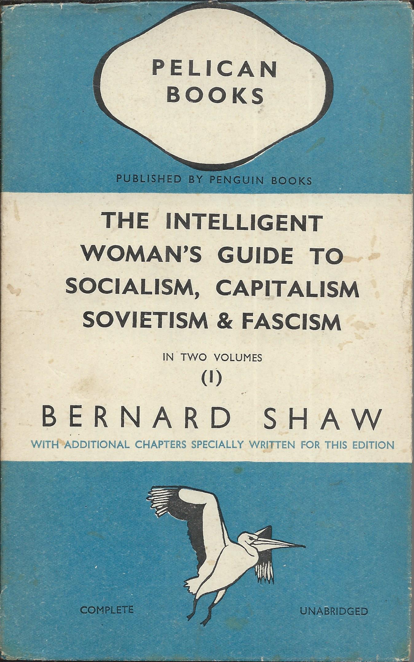
To launch the series though, they wanted something a bit different and they succeeded in persuading George Bernard Shaw, not only to allow a reprint of his ‘The intelligent woman’s guide to Socialism and Capitalism’ (published 9 years earlier), but to extend it by writing two new chapters on Sovietism and Fascism. As far as I know, these two chapters were the first new writing, not already published elsewhere, that Penguin had ever issued.
The book sold well, although judging by the number of copies surviving in pristine condition, many copies may have remained unread. That’s perhaps just as well, as Shaw was barely a democrat and certainly no strong opponent of either fascism or sovietism. He was attracted by, and effectively duped by, what he saw as strong leaders such as Mussolini and Stalin, and saw much to admire in Hitler. The arguments in his new chapters would not have stiffened many spines in pre-war Britain.
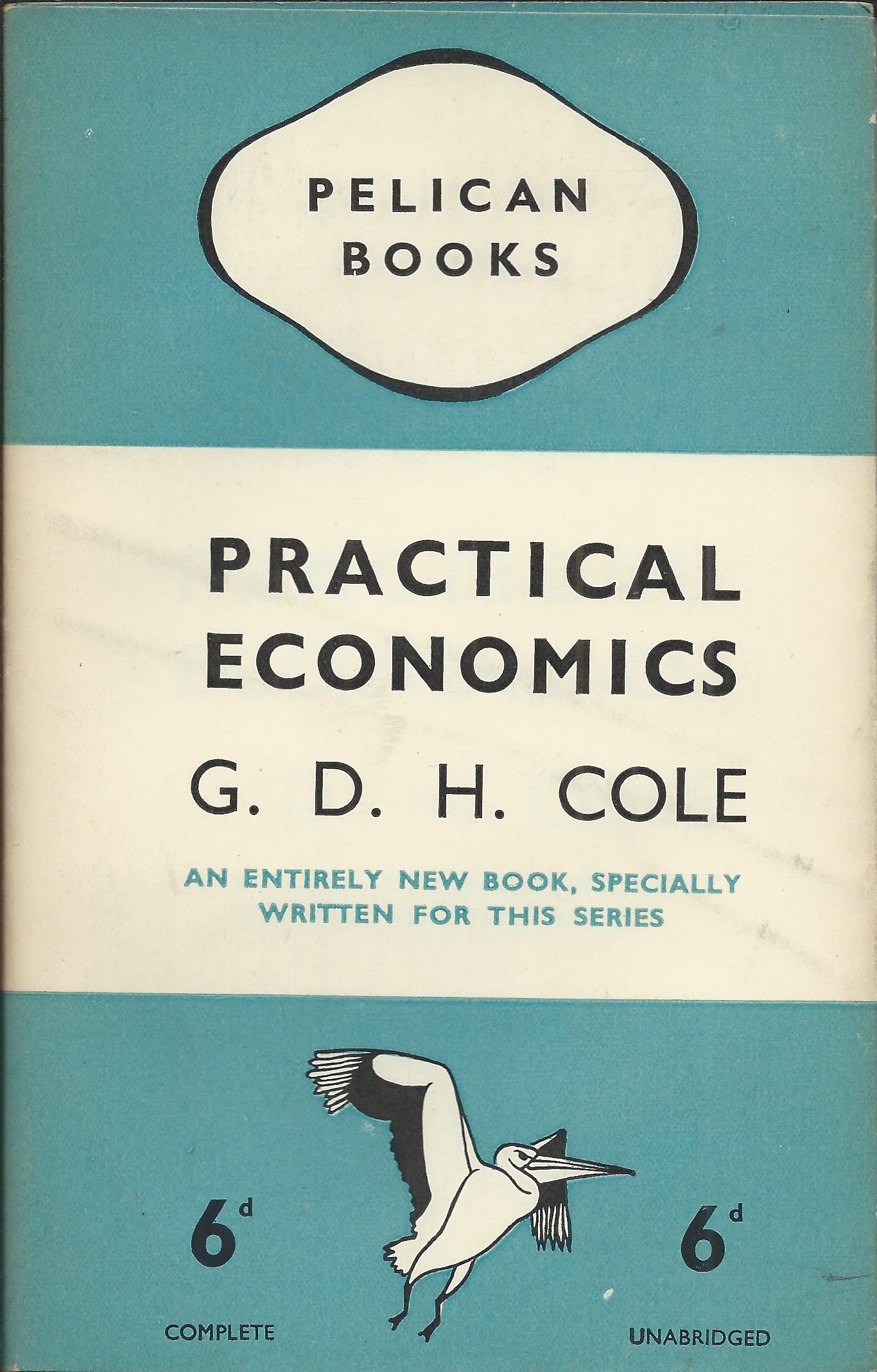
The book may though have given Penguin a taste for the publication of more new works. One of the other early Pelicans, ‘Practical Economics’ by G.D.H. Cole (volume A6) was also a new work specially written for the series. Indeed as this was an entirely new book and the first nine Pelican volumes were issued simultaneously in May 1937, this one rather than Shaw’s, should arguably be considered the first new work to be published by Penguin.
Others followed, although only sporadically at first in the Pelican list. The focus for new writing moved decisively away from Pelican with the launch of the Penguin Specials in late 1937. The first book in this series was a reprint, but the vast majority of the volumes, coming thick and fast after that, were new works written specially for the series – books written and published in almost record time as they reacted to fast-moving international events. In some ways the Penguin Specials were closer to journalism than to traditional book publishing.
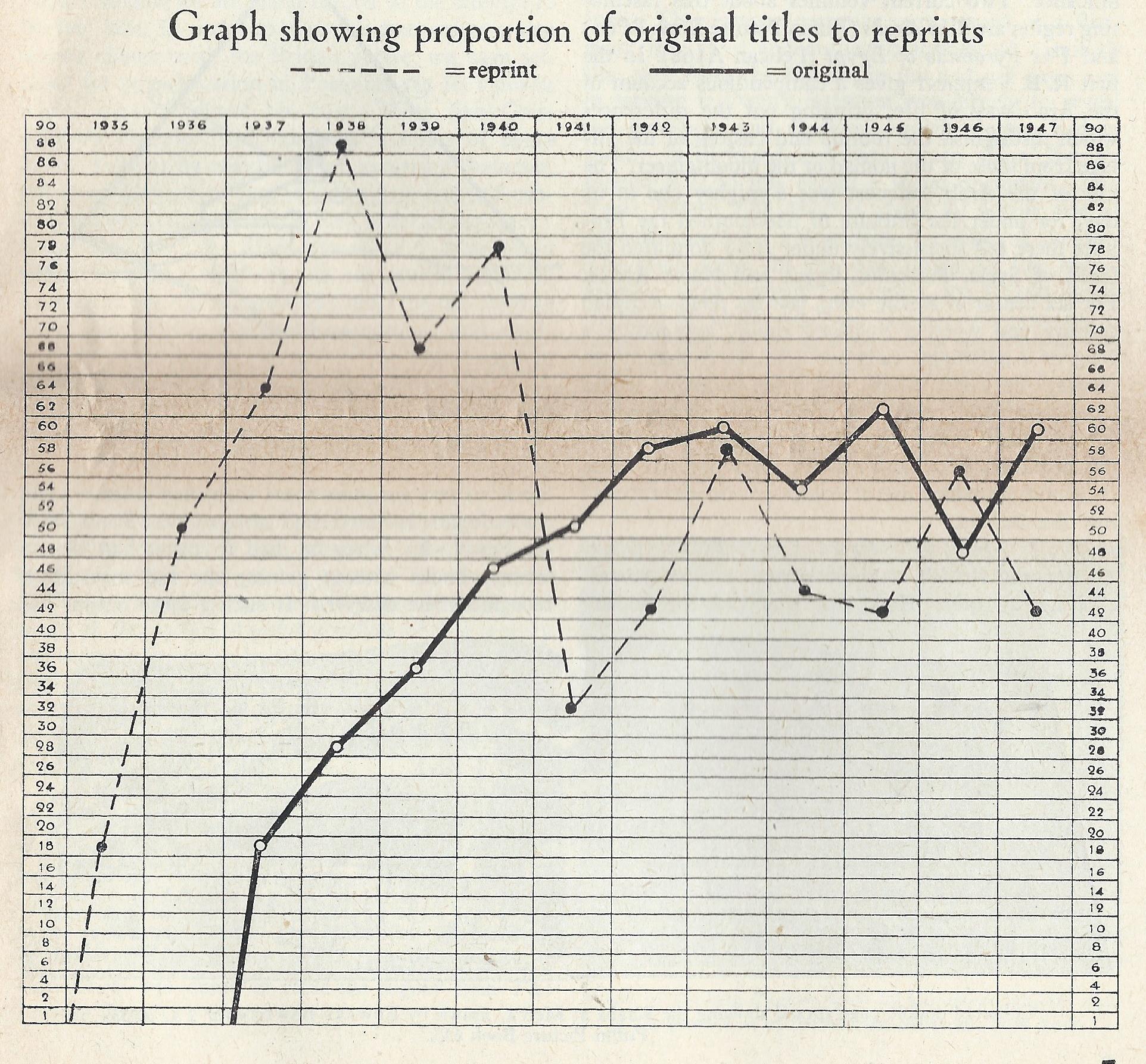
By mid-1940 the Penguin Specials had published around 40 completely new works. In comparison there were only about 10 new works in the Pelican list by this point. The academics and intellectuals who wrote for Pelican were certainly not used to writing at the speed of journalists. Nevertheless the combined effect of the two series and others like the King Penguins, was that astonishingly, by 1941 Penguin was publishing more original works than reprints. There’s a fascinating graph in one issue of Penguin’s Progress that shows how from a standing start in 1937, new works climbed rapidly to around 60 a year, while reprints fell from up to 90 a year, down to more like 50.
That’s an amazing change in a few short years and one that goes against most people’s preconceptions. It led to the surprising position where Penguin was selling hardback rights to other publishers for books that had been first published as paperbacks. And where Penguin also ended up publishing quite significant numbers of hardbacks itself. But that’s another story.

Collins sixpenny paperbacks from the pre-Penguin era
I’m still on a bit of a personal mission to show that Penguin revolutionised, but did not invent, the sixpenny paperback. The success of Penguin was so overwhelming that in retrospect it has obscured what went before and rather created the impression that Penguins appeared out of nowhere. In practice Penguins evolved from a long history of sixpenny paperbacks going back to Victorian times. I’ve already written about the Chatto & Windus series that ran from 1893 to the 1920s and about the Hutchinson series that ran roughly from 1925 to 1935. There are still many more to cover and this post now looks at pre-Penguin sixpenny paperbacks from Collins.
Collins are an interesting example, because for a long time after Penguin’s launch they were perhaps their closest competitor, with the Collins White Circle series. To see the effect that Penguin had, it’s interesting to compare Collins paperbacks from just before and just after that 1935 watershed.
The immediate changes caused by Penguin’s launch are not hard to see. Almost overnight, paperbacks became smaller, lost their cover illustration (other than a stylised design), gained a dustwrapper and generally became a bit more sober, respectable and middle class. As I’ve pointed out before, almost all of these changes were an aberration in historical terms and the earlier ones look rather more like modern paperbacks than the later ones do.
Collins had experimented with paperbacks over many years in various different formats and prices. They published a traditional series of large format 6d paperbacks in the early years of the twentieth century and then after the First World War tried out books in a smaller but chunkier format at ninepence.

Collins 6d from around 1905 and a 9d paperback possibly from the 1920s
But then towards the end of the 1920s they launched a more modern looking sixpenny series. The design clearly owes something to the Hutchinson series of Famous Copyright Novels. Where the Hutchinson covers were predominantly red, Collins were predominantly green (and incidentally, Hodder & Stoughton’s were yellow). Where Hutchinson had the title in yellow and the author’s name in white, Collins often had the title in red and the author’s name in yellow, although sometimes the colours switched round. Significantly in the light of what was to follow, both series moved away from fully pictorial covers to a more restrained design where the picture takes up only part of the cover.


Collins on the left, Hutchinson on the right
My guess is that this Collins series started around 1928. That’s largely based on the fact that several of the early books were first published in hardback around 1924/5, and one seems to be from 1927. Others went back much further, including books by Walter Scott, Charles Dickens and George Eliot. Most of the books were romances, adventure stories, crime stories or westerns.

Collins was starting to build a speciality in the fashionable field of crime fiction and this was cemented by the launch of the Collins Crime Club in 1930. It helped of course that they were the publisher for Agatha Christie, whose books were setting the standard for crime writing. The Crime Club was followed by the Wild West Club and as the 6d series went on, it was increasingly dominated by these two genres.
As with most pre-Penguin paperbacks, little is recorded of the Collins series, and I don’t know of any collectors, although I would have thought it was fairly collectable. It almost certainly includes the first paperback printings of many Agatha Christie stories as well as those of many other crime writers. I have a partial listing , drawn from the covers of the few copies I have, or have seen, which I’d be happy to share, and I’d like to hear of any other lists.
A few of the books seem to have switched away from the standard green covers to other colours, most strikingly a copy I have seen of Agatha Christie’s ‘Partners in Crime’ in red covers and a western from Hugh Pendexter in orange. As far as I can tell though these were exceptions and the vast majority of books were in green.


Unfortunately the books are undated and I can’t be sure for how long they continued. But I think the series went on right up to the launch of Penguin in July 1935. Suddenly then it looked old-fashioned and down-market in comparison to Penguin’s stylish but unillustrated covers. The inclusion of an Agatha Christie novel, ‘The mysterious affair at Styles’, in Penguin’s first ten was also an arrow aimed directly at the heart of Collins. This was Christie’s first novel and was (thought to be) available to Penguin because it had been published by the Bodley Head, before her move to Collins. Problems with the copyright led to it later being withdrawn and replaced by an alternative Christie title, but that didn’t help Collins.
By March 1936, the new Collins series was ready for launch. The first books in Penguin format were branded only as Crime Club books, but before long the overall ‘White Circle Books’ brand started to be used and it continued to be a significant challenger to Penguin, particularly on Crime and Mystery books, for the next 20 years.
By the 1950s though, Collins were starting to bridle at the self-imposed restrictions on the use of cover art, as indeed Penguin were. They started to experiment with going back to illustrated covers and a few books were issued that look remarkably like the 1930s predecessors to Penguin (although no longer at sixpence). Going back to the past was not the answer though. Cover art would of course return, but in a more modern form.


Chatto and Windus sixpenny paperbacks
It’s time to take another look at one of the many sixpenny paperback series that flourished before Penguin came along in 1935 to revolutionise the market – by selling paperbacks at sixpence. I come back to this popular misunderstanding of what Penguin’s paperback revolution was all about, because it certainly wasn’t about price.


The last sixpenny series I wrote about was the Hutchinson series of Famous Copyright Novels that ran from around 1925 to 1935. But the concept goes back much further than that. Chatto & Windus were selling sixpenny paperbacks from at least 1893 and the firm itself published a celebration of them in 1985 in a colourful book through their Hogarth Press imprint, called ‘Sixpenny Wonderfuls’. Thanks to a reader of the blog for bringing this to my attention. The title is intended as a reference and a contrast to the ‘penny dreadfuls’ that sold in vast numbers throughout the Victorian era, and reinforces the point that even sixpence was not a particularly cheap price for a paperback in those days. These books were by no means at the bottom of the market.
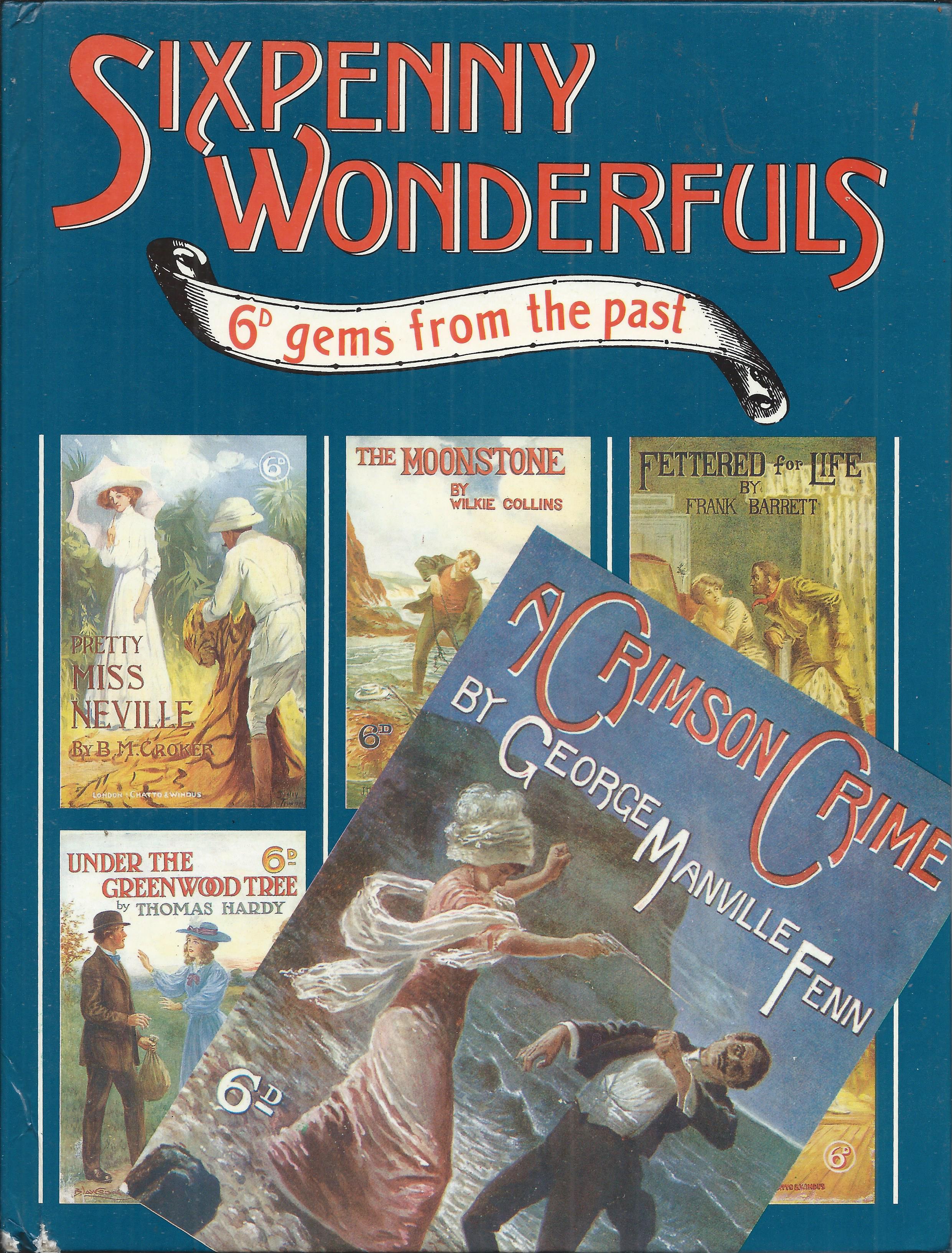
Chatto & Windus’ own celebration of their sixpenny paperbacks
Perhaps inevitably ‘Sixpenny Wonderfuls’ focuses more on the colourful and dramatic covers than on the contents of the books, and that in a way is the point here. These books sold because of their cover illustrations – forty years later Penguins sold because of their lack of cover illustrations.
I don’t know of any complete list of the Chatto and Windus Sixpennies and I don’t have any collection of them, so the illustrations here come from the Chatto book. It sounds though as if the firm itself may have some quite detailed records, covering not only titles but printing numbers. They note that one of the first titles, ‘The cloister and the hearth’ by Charles Reade, had an initial print run of 50,000 in 1893 and went on to sell 380,000 copies in its sixpenny edition over the next 15 years. And that was a book that was already over 30 years old at the start of the series. You’ll be lucky to find a single copy of it today though. The internet is awash with hardback copies, but those hundreds of thousands of paperbacks have disappeared almost without trace.


There is probably even less chance though of finding a copy of ‘Antonina’ by Wilkie Collins, also published in 1893 in the series, but selling only 1,240 copies according to Chatto’s records. Clearly it was a hit-and-miss business.
Nevertheless the series seems to have prospered and I would guess it covered perhaps a couple of hundred titles over its 30 year history. It survived the First World War, although with few new titles being added, and in the post-war years it found it difficult to generate the levels of sales achieved pre-war. It’s unclear exactly when the series ended. Copies may have continued to be sold even into the early 1930s, but in terms of new titles it probably ended in the early 1920s.
The idea of sixpenny paperbacks certainly didn’t end then. New series from Hutchinson and from Collins were only getting going at that point, and Penguins were not even a gleam in Allen Lane’s eye, but the fashion for Chatto and Windus’ stories and their dramatic cover illustrations had come to an end.


The series was dominated by adventure stories and relatively light romances. Books by Ouida and B.M. Croker sold well, as did those by Walter Besant and Charles Reade. Their names may not be widely recognised today, but many of the other authors would be. The series contained books by Wilkie Collins, Thomas Hardy, Arthur Conan Doyle, Mark Twain, Robert Louis Stevenson, Emile Zola and Arnold Bennett. For comparison, it’s worth remembering that despite the reputation for quality, most of the authors and titles of the first couple of hundred Penguins are now justly forgotten. Amongst the few still remembered are Conan Doyle and Bennett.

Unser Kampf in Australia
This is the story of a very unusual Penguin from the other side of the world.

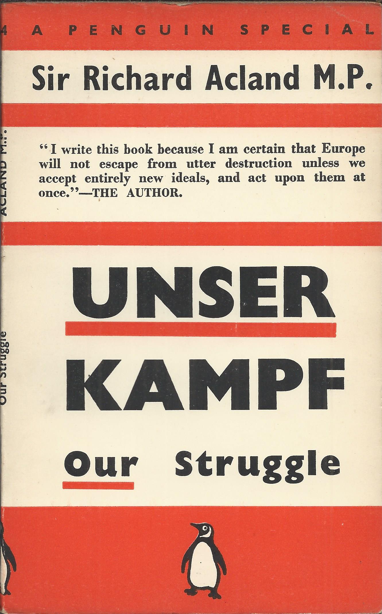
At first sight it’s very clearly a Penguin. The broad bands of colour and the Penguin symbol make it instantly recognisable, even though the bands are red rather than the more familiar orange. The more striped effect at the top, and the text-heavy cover, mark it out as a Penguin Special, one of the series of topical books on current affairs that sold millions in the run-up to, and the early years of, the Second World War.
But after that first impression, other things don’t seem quite right. Firstly it’s the wrong size. Basically all Penguins at that time (this was printed in 1940) were of a standard size – the size that Penguin had adopted from the European series of Albatross Books, and which in turn had been copied by almost all other British paperback publishers. This one is larger, roughly 14 cm by 22 cm. It’s also made up of a single gathering, stapled in the middle, so has a rounded spine, unlike the flatter spine of almost all other Penguins.
Then the cover has been printed in three colours – black, blue and red. Almost all other Penguin covers at the time were printed in two colours, typically orange and black. This one has an extra colour to allow the British and Australian flags to appear, and that also seems to account for why it’s red rather than orange. Interestingly it’s not the current Australian flag. The version then in use was the Australian Red Ensign, which changed to blue only in 1954. It’s also noteworthy that the penguin logo is printed in blue rather than black.

This is an Australian printing of course, but that in itself is not particularly unusual. Over 70 UK Penguins were reprinted in Australia during the war years, given the difficulty in exporting copies from the UK. They were published through a local company, Lothian Publishing Company Pty. Ltd., whose name generally appears on the title page, below that of Penguin Books. But this book has no mention of Lothian, crediting only a local printer in Melbourne.
Lothian’s own list of the Penguin books they published in Australia does though include it and shows it as the very first such book in August 1940, almost two years before any others followed. Why did this particular book justify such an unusual step?

The author, Sir Richard Acland, was a British Liberal Party MP (and a 15th generation baronet), who had been stridently against the policy of appeasement being followed by the UK Governments under Stanley Baldwin and Neville Chamberlain. In 1938 he had engineered a famous by-election in Bridgwater, a Conservative-held constituency neighbouring his own in Barnstaple, and persuaded a journalist, Vernon Bartlett, to stand as an ‘Independent Progressive’ anti-appeasement candidate. Both the Liberal and Labour parties agreed to stand down in favour of Bartlett, leaving him a clear run against a Conservative candidate in the election, which he won by a relatively small majority.
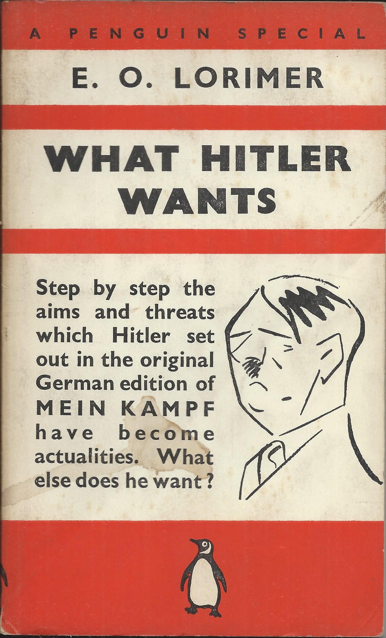
Acland’s book, ‘Unser Kampf’ was written after the outbreak of war and published as a Penguin Special in the UK in February 1940 – volume S54 of the series. It is a plan for a new world order to be established after the war, and almost a manifesto for a new political movement. Acland went on to be one of the main founders of the Common Wealth Party in 1942, with J.B. Priestley and Tom Wintringham amongst others. He stood for the new party in the 1945 election, but it fared badly and he lost his seat, later defecting to Labour and being elected as a Labour MP.
Clearly his book was a significant contribution to the debate at a time of high interest in public affairs. but was it any more than that? It was not one of the Penguin Specials chosen for reprinting in the US (although interestingly one of Tom Wintringham’s books was). Did it then have any special relevance in Australia, more than any of the other Penguin Specials, several of which dealt with similar subjects? I’m not convinced that it did, although the Preface to the Australian Edition suggests that “To enable the demand to be met, it has been found necessary to reprint in Australia”.

It is unclear who wrote this rather evangelical preface. It refers to both the author and the English publishers (Penguin Books) in the third party, and thanks them for agreeing to no royalties or copyright fees. So presumably somebody else wrote it and it reads as if written by a supporter of Acland, rather than by a publisher. I suspect that it was local supporters of Acland, or his ideas, who promoted the idea of reprinting it in Australia, and possibly approached Lothian with the suggestion. Could that in turn have been what sparked later negotiations between Lothian and Penguin about reprinting other titles?
It does seem to have been reasonably successful, with 10,000 copies in the first printing of August 1940, followed by a second printing of a further 10,000 copies in the same month. Enough to interest Lothian in extending the collaboration with Penguin?
There are still other oddities though with this very odd book. The UK edition is titled ‘Unser Kampf’ with ‘Our struggle’ as a sub-title, while the Australian edition reverses this. Were Australians thought to be even more uncomfortable with foreign languages than the British? Or less familiar with the title of Hitler’s ‘Mein Kampf’, which it echoes? It seems just a little condescending.
And despite the changes to the front cover, the back cover just copies the UK back cover other than to add ‘Printed in Australia’. So it has a list of the ‘Latest Specials’, most if not all of which, would not have been available in Australia.

Acknowledgements: Some of the information about Australian printings in this post, comes from an article written by Chris Barling in the Penguin Collector’s Society newsletter for May 1987. For more about the Bridgwater by-election of 1938, see https://vernonbartlett.co.uk/

Keep the blue flag flying
Pelican Books, the non-fiction imprint of Penguin, launched in 1937 and brought books on a huge range of serious topics within the range of ordinary people, publishing them at the standard Penguin price of sixpence. They sold in their hundreds of thousands, bringing education to the masses. It was conceived as an educational series. It was no accident that one of the key editors behind Pelican was W.E. Williams, also closely involved in the Workers Educational Association.


But that’s also a clue to another aspect of Pelican Books that was perhaps less evident. Despite the blue covers of the books, this for at least the first couple of years was very definitely a left wing publisher. Take a look at the first few volumes. Volumes 1 and 2 are ‘The intelligent woman’s guide to Socialism, Capitalism, Sovietism and Fascism’ by Bernard Shaw. The title manages in just a few words to be both patronising and sexist, but also essentially misleading. This is no even-handed review of political philosophies. Shaw was a Fabian socialist and this is a rationalisation of his political beliefs.
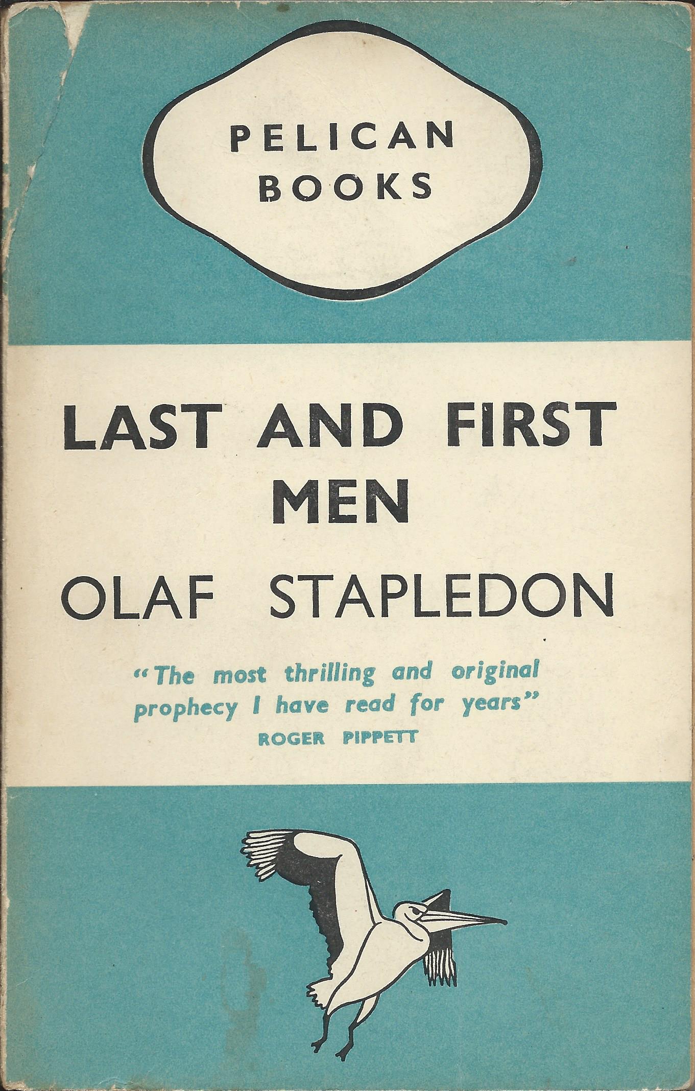
Volume 3 is a very odd book to be included in the first few volumes of what is ostensibly a non-fiction series. ‘Last and First Men’ by Olaf Stapledon is a science fiction novel, described as ‘a story of the near and far future’. It is certainly fiction and would have been more appropriately published in the main Penguin series rather than Pelican. For what it’s worth though, the author was undoubtedly left wing in his political beliefs, and during the war a supporter of the socialist Common Wealth party.
Volume 4 was a book on archaeology by Sir Leonard Woolley and probably outside the left / right spectrum, but volume 5 (‘A short history of the world’ by H.G. Wells) and volume 6 (‘Practical Economics’ by G.D.H. Cole) were both the work of prominent socialists. Volume 7 (‘Essays in Popular Science’ by Julian Huxley) is again hard to categorise as left or right wing, but there is no doubt about volume 8. ‘The floating republic’ by Bonamy Dobrée & G.E. Manwaring is the story of a naval mutiny and effectively an early example of trade union activism. It may be presented as the non-political work of academic historians, but it is also a revising of history from a socialist perspective.

Volume 9 is the first of several volumes of a ‘History of the English people’ by Élie Halévy, surprisingly the work of a Frenchman. Halévy was probably better described as a Liberal than as a Socialist, but he had left wing sympathies and he lectured and wrote on the history of socialism. Volume 10 is then a book on astrophysics by Sir James Jeans.
This general pattern of mixing non-political volumes with volumes on a range of subjects by left wing authors, continued for a considerable time. Over the next year or two the series included works by a long list of prominent socialists including J.B.S. Haldane, Harold Laski, R.H. Tawney, Beatrice Webb and G.D.H. Cole, and communists such as J.G. Crowther and Petr Kropotkin. There were also several works by members of the Bloomsbury Group, including both Virginia and Leonard Woolf, Roger Fry and Clive Bell, all generally left / liberal if not socialist in their politics. There are also plenty of non-political authors, but I struggle to find a single author in the first 50 volumes who could be clearly described as right wing. What is striking to me is that these are not necessarily books about politics, economics or history – even for books about science or art, the series seems to have searched out left-wing authors.


There were of course other left wing publishers and left wing series. The Left Book Club published by Gollancz springs to mind and was a successful series at much the same time as Pelican. The difference though is that buyers of the Left Book Club were in no doubt about what they were buying. Pelican’s position was much less explicit. In buying a Pelican you were buying into a certain culture of popular education, but I’m not sure it was clear that you were buying into a left wing philosophy.

The key person behind the political positioning of Pelican Books was probably not Allen Lane, the owner of Penguin, but V.K. Krishna Menon, whom Lane appointed as overall Editor of the series. In appointing him though, Lane must have known what he was getting. Krishna Menon had worked as an editor at Bodley Head, the Lane family firm, and he had been a Labour councillor in St Pancras since 1934. He was being considered as a Labour parliamentary candidate, but this fell through because of suspicions that he was actually a Communist. He was a close friend of Nehru, a passionate advocate of Indian independence and a fierce opponent of the British Empire, to the extent that there were doubts about his loyalty to Britain during the war years.
He did not of course have total freedom to develop the Pelican list as he chose. He was supported by three Advisory Editors, although it seems doubtful that they were much of a check on his left wing tendencies. W.E. Williams, mentioned at the start of this post, was one of them. He was primarily an educationalist, but certainly also a socialist. As well as his role with the Workers Educational Association, he went on to head up the Army Bureau of Current Affairs, which was later accused of being so effective at spreading left wing opinion in the armed forces that it influenced the result of the 1945 election.
Then there was H.L. Beales, a historian and another socialist. In this context it is interesting to note a comment in the introduction by J.M. Winter to a much later collection of essays by R.H. Tawney: ‘That … working-class culture is a central part of European historical writing today is in part because of Tawney’s work and example, and that of a group of his contemporaries among whom G.D.H. Cole, H.L. Beales, the Webbs and the Hammonds are the most prominent.’ Every one of those mentioned was involved with Pelican in those early days. It seems fair to assume that Beales was influential on the inclusion of Tawney, Cole and Beatrice Webb as well as J.L. (John) and Barbara Hammond in the series.
The third advisory editor at the start of Pelican was Lancelot Hogben, a biologist, who later had a rather odd book of his own published by Pelican. ‘Interglossa’, published in 1943, was a plan for a new world language to be part of a new world order after the war. He was also a socialist. So the overall editor of the series was a socialist, seen at the time as perhaps a bit of a firebrand, and all three of the advisory editors were known socialists. Is it surprising that they kept the red flag flying in its Pelican blue camouflage?
It didn’t last of course. The relationship between Krishna Menon and Lane deteriorated and ended with Krishna Menon leaving at the end of 1938. The last volume to carry his name as editor was volume 33, although it’s probably fair to see his influence in terms of the choice of titles and authors at least across the first 50 volumes.

Leisure wares
Large publishing groups like HarperCollins, Penguin Random House or Hachette today use lots of different imprints for the books they publish. I’m not very sure why, because most readers would have little idea of the publisher’s name even after reading a book, never mind before buying it.
It wasn’t always so. Paperback series used to cultivate brand loyalty and the brand was very clearly signalled on the covers. If you bought a Penguin Book in the 1930s, 1940s or even later, you certainly knew it was a Penguin, both before you bought it and after you had read it. And given Penguin’s success, almost all other paperback publishers adopted clear and prominent brand identities as well. Which left Hutchinson, the HarperCollins of its day, with a problem. The Hutchinson Group contained a long list of publishing companies and it’s not clear to me how much cooperation there was between them. So they ended up with not one paperback series competing with Penguin, but several.

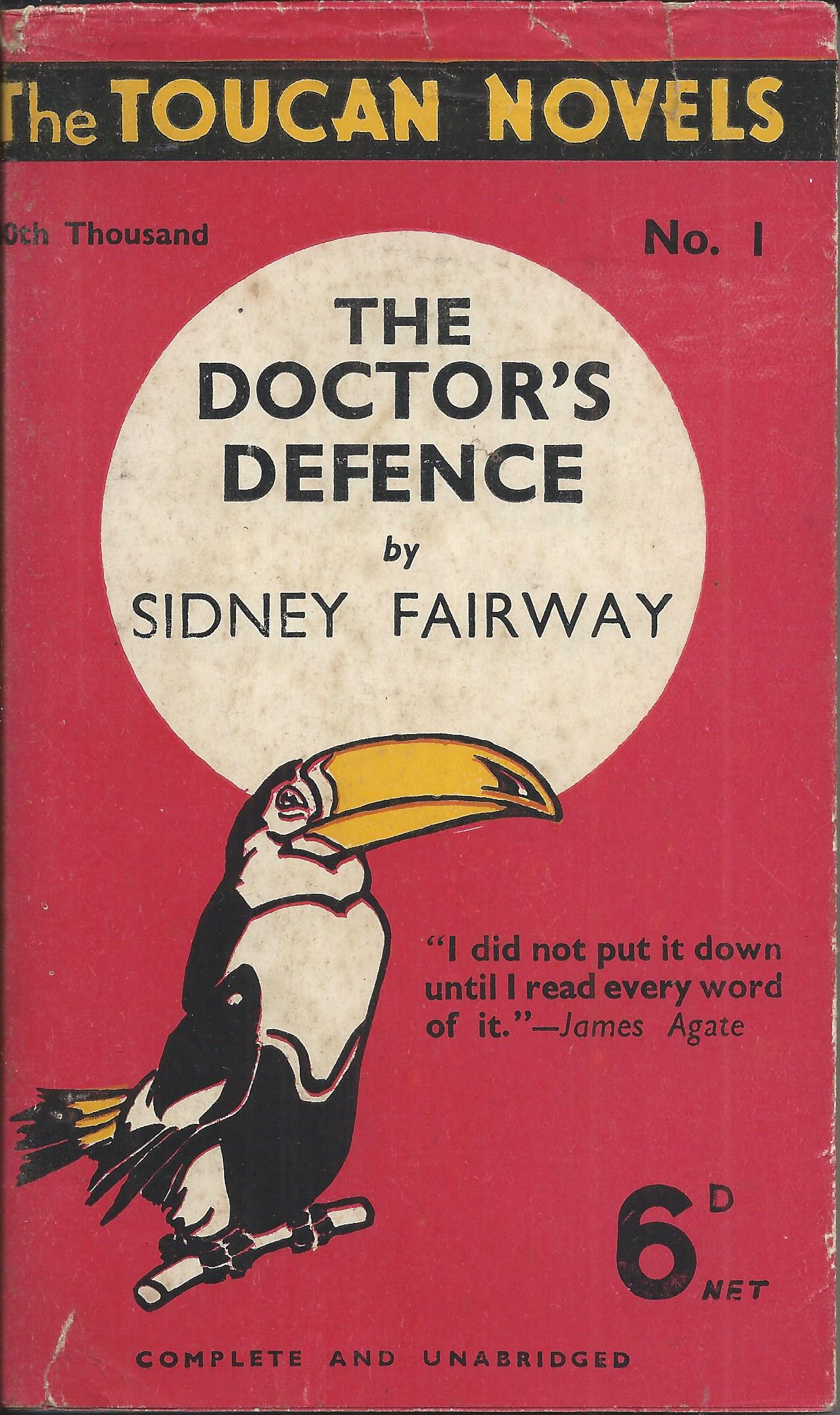
The Hutchinson Pocket Library was perhaps their flagship series in response to Penguin, but from different parts of the group also came Jarrolds Jackdaw books, Toucan books, John Long Four Square Thrillers and the Hutchinson Popular Pocket Library.
For several years in the late 1930s, the Leisure Library Company, another part of Hutchinson, resisted the trend to Penguinisation. They continued to publish paperbacks that were a throwback to pre-Penguin days – larger format, brightly illustrated covers, and selling for just 3d or 4d, substantially undercutting Penguin on price, but unashamedly down-market. Although Penguin mythology lauds the company for selling books at the low price of 6d, in reality Penguins were more at the top end of the paperback price range and only just below the 7d price of cheap hardbacks at the time.


But in 1940 the Leisure Library capitulated and joined the rush to establish Penguin-style paperback series, adding another to Hutchinson’s long list. Although in this case, it might be more accurate to describe them as Collins White Circle style.


Like Collins, the Leisure Library started separate sub-series for crime, westerns and romantic novels. Each sub-series had its own colour, with both companies using green for crime and yellow for westerns, and each added a stylised picture as part of the cover design.

To some extent also like Collins, the connection between the sub-series was not particularly emphasised, and the books were primarily branded as coming from ‘The Wild West Library’, ‘Crime Novel Library’ or ‘Romantic Novel Library’. The crime and romance novels are still shown as published by the Leisure Library Co. on the title page and the spine, but the westerns refer only to the Wild West Library. The westerns are though clearly linked to the crime novels by the square white title panel with perforated edges. These two series could almost have been called the Hutchinson White Square books, but oddly the Romance sub-series went for a white circle instead, making it easily confused with the Collins series.

The series was not very long-lived, although that was probably as much to do with the effect of the war on publishing, as with the commercial success or failure of the books. They were all published in 1940, in a relatively short period between about May and July, and few paperback series were able to maintain much of a publishing programme after that until the end of the war. There were a total of 32 books – fourteen crime, twelve westerns and six romances. I don’t think any of them have achieved much of a mark on literary history, even amongst fans of the relevant genres, but they added another layer to the story of the paperback revolution unleashed by Penguin.


Special Penguins
Allen Lane’s decision to abandon cover art when he launched Penguin Books in July 1935, was a revolutionary move that was followed by almost all of his competitors. Previously lurid cover designs gave way to much more restrained design. So what is happening just two years later, when Lane seems to abandon all restraint with the Penguin Specials series?
It is not yet the return of multi-coloured cover art. It would be many more years before Lane could reconcile himself to such a step. But the screaming headlines, the long prose blurbs and the occasional cartoons and maps on the covers of the Penguin Specials are a long way away from the simple tripartite model of the main Penguin series.


The series of topical political tracts on world affairs, launched in late 1937 was a huge success. The turbulent state of European politics had created an appetite for information on international affairs that Lane was happy to satisfy. The initial print run of 50,000 for the first volume sold out within four days and had to be almost immediately reprinted. Other books sold in their hundreds of thousands and their success gave Penguin a platform for later domination. When paper rationing was introduced later in the war, the allocations were based on paper use in these pre-war years and Penguin were using paper in vast quantities.
But why the lack of restraint in design? Penguin seem to have decided that in the political situation of the time, with the threat of war looming, restraint was simply not appropriate. Every new book in the series, and every new topic, was a matter of screaming urgency and the covers should reflect this.
And the books were after all, despite their lack of restraint, still recognisably Penguins. Enough of the basic Penguin design was retained for that to be clear. They carried the Penguin brand and the values associated with it – a certain vague notion of seriousness, quality and intellectual aspiration. Despite the shoutiness of the covers, these were not to be seen as populist or downmarket. The basic colour was still orange, the colour most associated with Penguin (or Pelican blue for those volumes branded as Pelican specials), the design was still based on horizontal bands, the Penguin logo was still in much the same place at the bottom of the front cover, and the price of course was still 6d.


The style of cover was not really new. The covers remind me particularly of the dustwrapper designs on many hardback books from Gollancz in the 1930s, and no doubt other publishers too. But I don’t think they were normal on paperbacks at this time, and if anybody was going to introduce them, the last person you’d have in mind would be Allen Lane. For the second time in three years, he was revolutionising paperback cover design.
But in the end this one wasn’t really a revolution. Other companies didn’t copy it, although Hutchinson moved some way in the same direction for a while. Perhaps even more significantly, Penguin themselves didn’t persist for too long with the policy. When war was declared in September 1939, the series had reached almost 40 titles, but gradually screaming headlines started to give way to the more sober realities of war. By 1942, as the series passed 100 volumes, a new design was emerging that had no room for long quotations or cartoons and was much more like the classic Penguin design. This looks to me to be a recognition that the technique of shouting can be very effective in the short term, particularly if unexpected, but almost inevitably loses its effectiveness and shows diminishing returns if persisted with. Restraint was back in fashion.
A Penguin special from 1943
